‘The Magic Flute’ theatre collateral
I created some collateral for a theatre performance called The Magic Flute. This particular assignment at university was a real-life job situation where someone’s design was selected.
Whenever I draw, I use a freehand drawing style and take advantage of the library of brush-style strokes offered in Adobe Illustrator or otherwise, create the line work on paper and convert it to a digital image. I used this freehand drawing style to my advantage, along with a warm colour scheme and balanced design to create an engaging design.
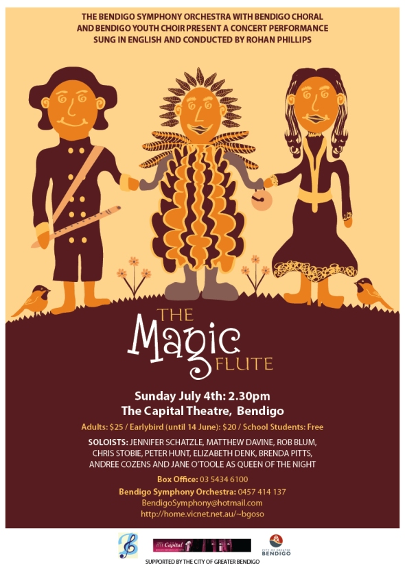
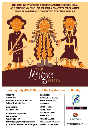
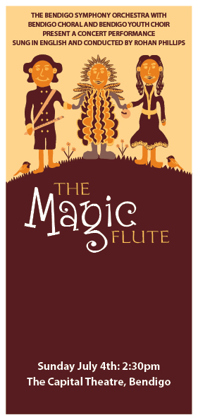
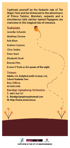
The main feature of the project was an A3 advertising poster, however, I also presented a range of other promotional material to develop skills in creating a visual identity that would be consistently applied to all material. This included a newspaper advertisement, DL flyer, programme and ticket design along with documentation to present the range of material to the client.
Feel free to browse the range of material that was created for The Magic Flute. Alongside the following images, there are also a couple of documents created which are viewable as PDF files, including:
Marketing Strategy Documentation
These links open in new windows or tabs, depending on your web browser and its settings. Adobe Reader is also required to view the links so click here to download this software (link opens in new window or tab, depending on your web browser and its settings).
Poster
Newspaper Ad
DL Flyer
Ticket

I recognise your style instantly, now. Nice job. Great colour scheme, too!
June 5, 2010 at 8:53 pm
Thanks,
I loved the style too. I felt so proud to achieve this design and rise above challenges
June 5, 2010 at 11:53 pm
i love the colour tones and the design daniel. gorgeous!!!
June 6, 2010 at 3:02 pm
Thank you so much!
I had great fun doing this. One challenge we were required to work with was that the design was only a 3-colour design. This meant I could not mix inks using the four colours (standard on a printer) of Cyan (a blue), Magenta (a pink), Yellow and Black to mix colours together. I had to instead, use only three-colours of inks that in real life, would be loaded onto the printing press before printing.
I loved the warm tones of the colours though. It’s amazing what you can do with constraints!
June 6, 2010 at 10:56 pm